
Quantum Design System
Over many years, the Electronic Arts digital platform developed multiple aesthetics across web, mobile, PC and console resulting in a widely varied experience. During my time at EA, I was asked to develop a unified visual language and UI system. The result was Quantum - a full stack, multi-platform design system that would power the next generation of gaming platforms that were being developed.
Phase 1: The Landscape
EA’s digital presence exists across many products on the Web, PC & Mac, Xbox & Playstation and in-game.
Before defining a unified visual language, we needed to assess the landscape to understand how the brand is being expressed in each location to better gauge the visual and layout constraints of each platform as well as identify the various components that would need to cut across each.

EA Access: Xbox One

Origin PC Client: PC/Mac

Marketing Microsites: Web

EA Identity Window: Web

EA Access: PS5

Phase 2: Inspiration
Finding the right tone to appeal to gamers, yet be functional and scalable.
I found inspiration by looking outside of existing gaming platforms, which tended to be overly stylized and contain heavy visual treatments that would be difficult to scale over many surfaces. I wanted to develop a more functional aesthetic that still appealed to gamers' more visceral visual preferences while establishing an identity that could be recognized across platforms without taking away from the gaming content itself.


Phase 3: Concept Development
The initial style tile.
Taking the explorations a step further, and began looking at how these tones could apply to various foundational design elements. This allowed me to define and battle-test a few rules of the system while helping design leadership buy-in of the aesthetic before moving further forward.

Phase 3: The Metaphor
A visual language derived from the elements of particle physics.

Photons
All colors, strokes and transitions were based on the behaviors of how light moves through space.
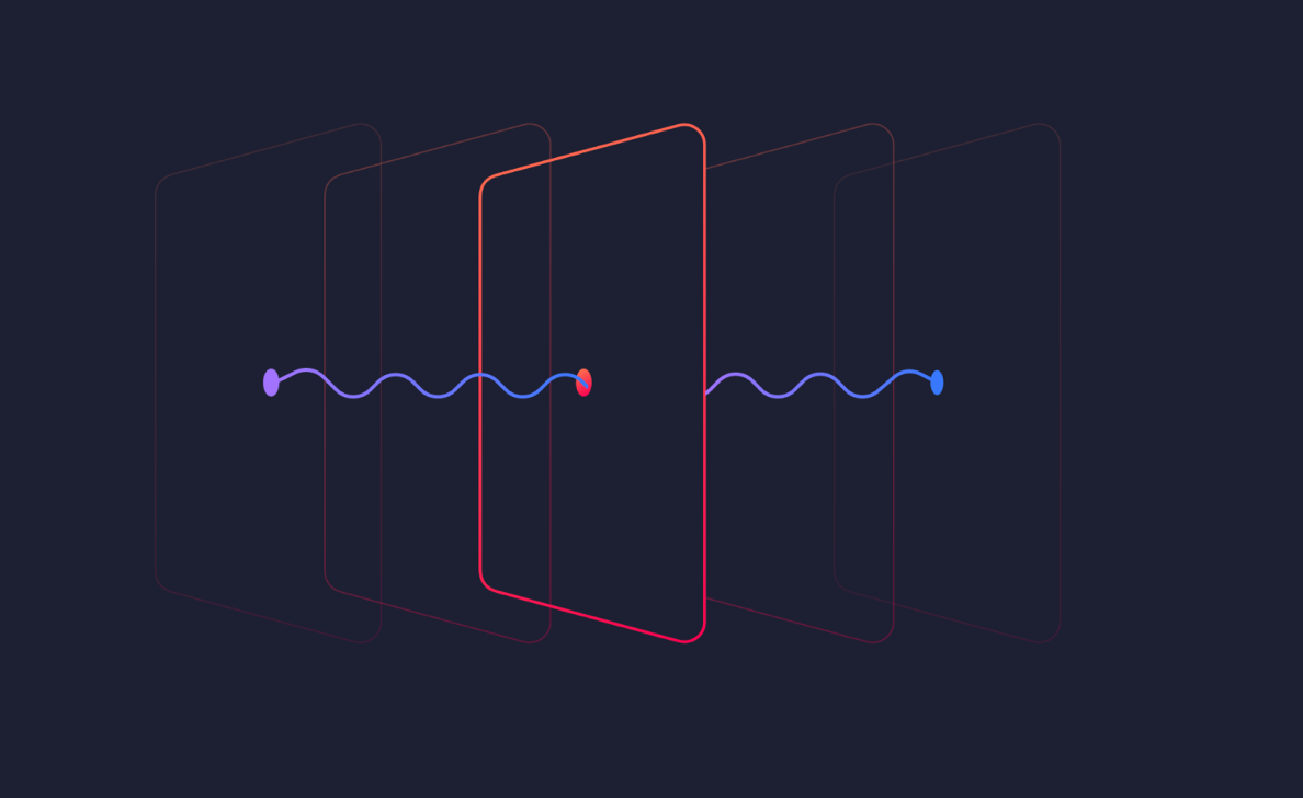

Fields
The scale, hierarchy and depth of elements would be determined by the field (z-index) they exist within.
Radiation
UI elements could receive or emit light. This would be used to communicate interactivity and draw focus where needed.

Phase 4: Foundational Design Decisions
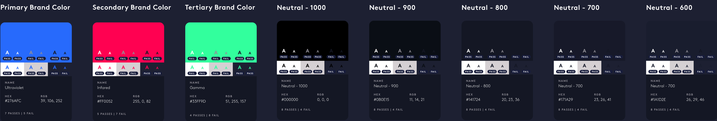
I Defined the Visual Foundations of the System
Colors

Typography

01. Display Typeface - Major section titles and headings.

02. Primary Typeface - Large bodies of copy, descriptions where readability is critical.

03. Monospaced - Isolated data presentation and labelling.

Spacing
Strokes

Shapes


Codifying Design Decisions as Tokens
To ensure these design decisions were applied consistently across the various platforms. We stored all design decisions as variables that could be transformed through a server-based system that then passes a language & platform-specific variant of that token straight into the code. This created consistency but also gave us central control to make tweaks in one place that propagated out.

Phase 5: Component Development
We then applied these design decisions to the suite of UI components we needed in the system.

Tiles
Social Components


Buttons

Media


Animation & Loaders


Phase 6: Documentation
To make sure the entire org from Product Managers, Designers and Engineers could use the systems, we developed a detailed documentation site and workflows around these components.

